Skip to content

Cart

Your cart is empty

Continue shopping
Réparation Trous + Ourlet Chaînette

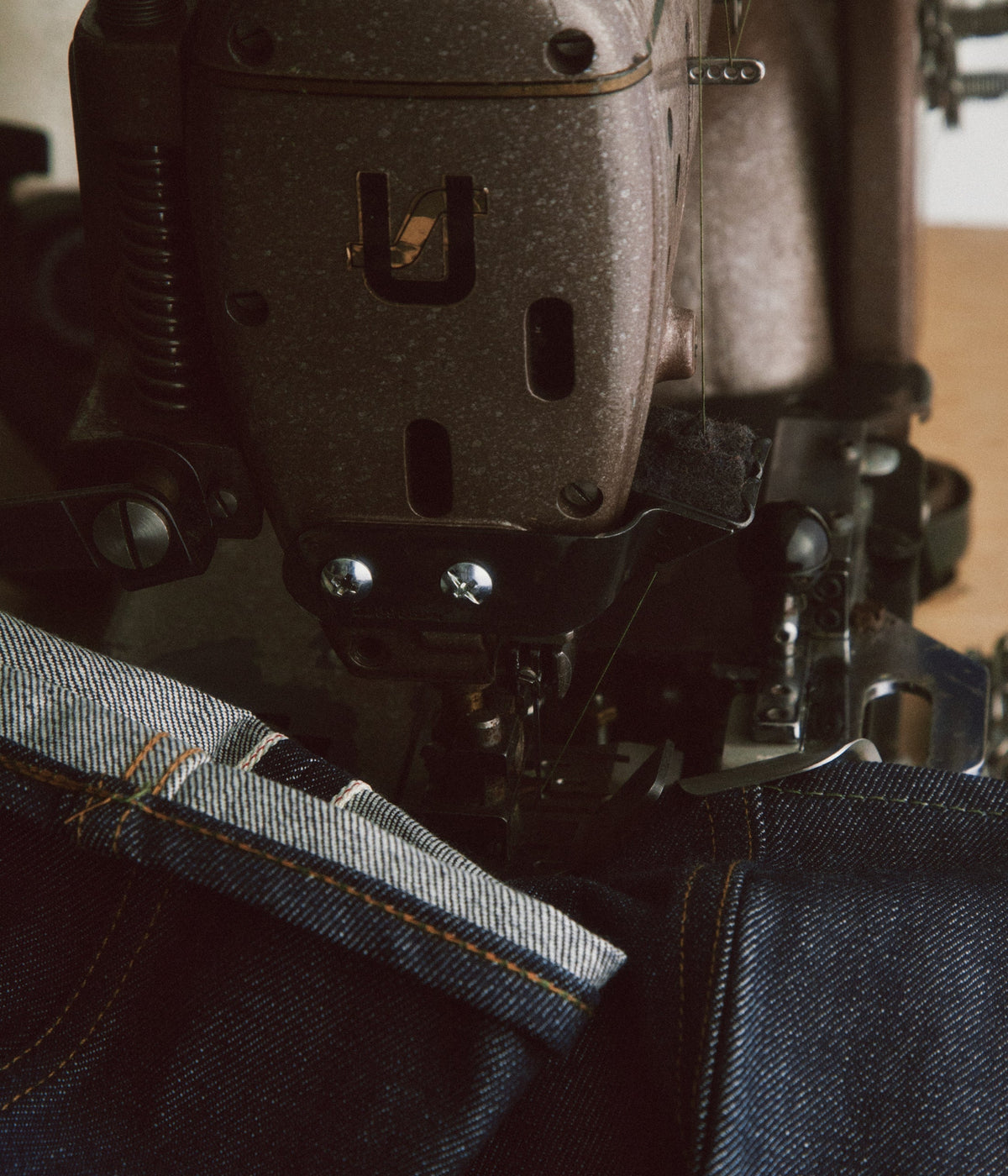
Chain-stitch hem, on a Union Special

Add the hem

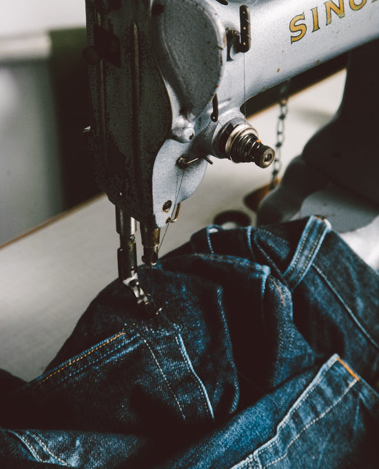
A worn pair of jeans, even from another brand? The Toulouse workshop repairs it

Send my jeans
Champ de Manœuvres · Shop color chart

Five moods, one wardrobe

Three colors hold the whole house together: ivory, yellow and blue. Yellow is life, creativity, movement. Blue is harmony. And ivory is the raw canvas on which the two sit.

The five moods below are simply five ways of matching them. The choice is made at the bottom of each page, and it follows you from one visit to the next.

In the vat, indigo is yellow-green

This is the paradox of dyeing that underlies our entire wardrobe. A piece dipped in the indigo bath comes out yellow-green. It has to be taken out, opened up, and left to breathe: on contact with the air, under the dyer’s eyes, the green fades and the blue rises. This moment is called déverdissage, literally the un-greening.

Yellow and blue are therefore not two opposite colors that we forced together. They are the same dye at two moments of its life: momentum first, harmony afterward. That is why, in all our moods, the button that makes you act is yellow and the background that lets you look is blue.

Champ de Manoeuvres Add to cart

Light

Ref. 01 · ivory & midnight blue

The base outfit, and the complete match: the ivory of raw canvas, the blue of harmony, the yellow of momentum. The house’s three colors, in the right proportions.

Ivory plays the role of calm: it leaves all the room to the garment and asks for nothing. If the visitor chooses nothing, this is what they see.

#F5F5F6 fond #0E074F encre #F0C23C action
Champ de Manoeuvres Add to cart

Dark

Ref. 02 · midnight blue

Harmony takes all the space: the blue rises to night, the ink turns ivory. The yellow stays put: the only spark of life in the blue, it becomes the one place the eye goes.

The mood for late evenings and low-brightness screens. Workshop photos benefit: the fabric stands out instead of fighting a white background.

#0F1020 fond #ECE9E2 encre #F0C23C action
Champ de Manoeuvres Add to cart

Clear night

Ref. 03 · slate & steel

A less dense night, pulled toward slate: the light of a workshop in the early morning, when the machines are still cold. Yellow lightens by a tone to keep its bite on this blue-gray.

For those who find black too heavy and white too harsh. It is the most legible mood for long texts, garment stories, blog articles.

#1D2430 fond #F7F7F7 encre #FFD34D action
Champ de Manoeuvres Add to cart

Mili

Ref. 04 · sand & olive drab

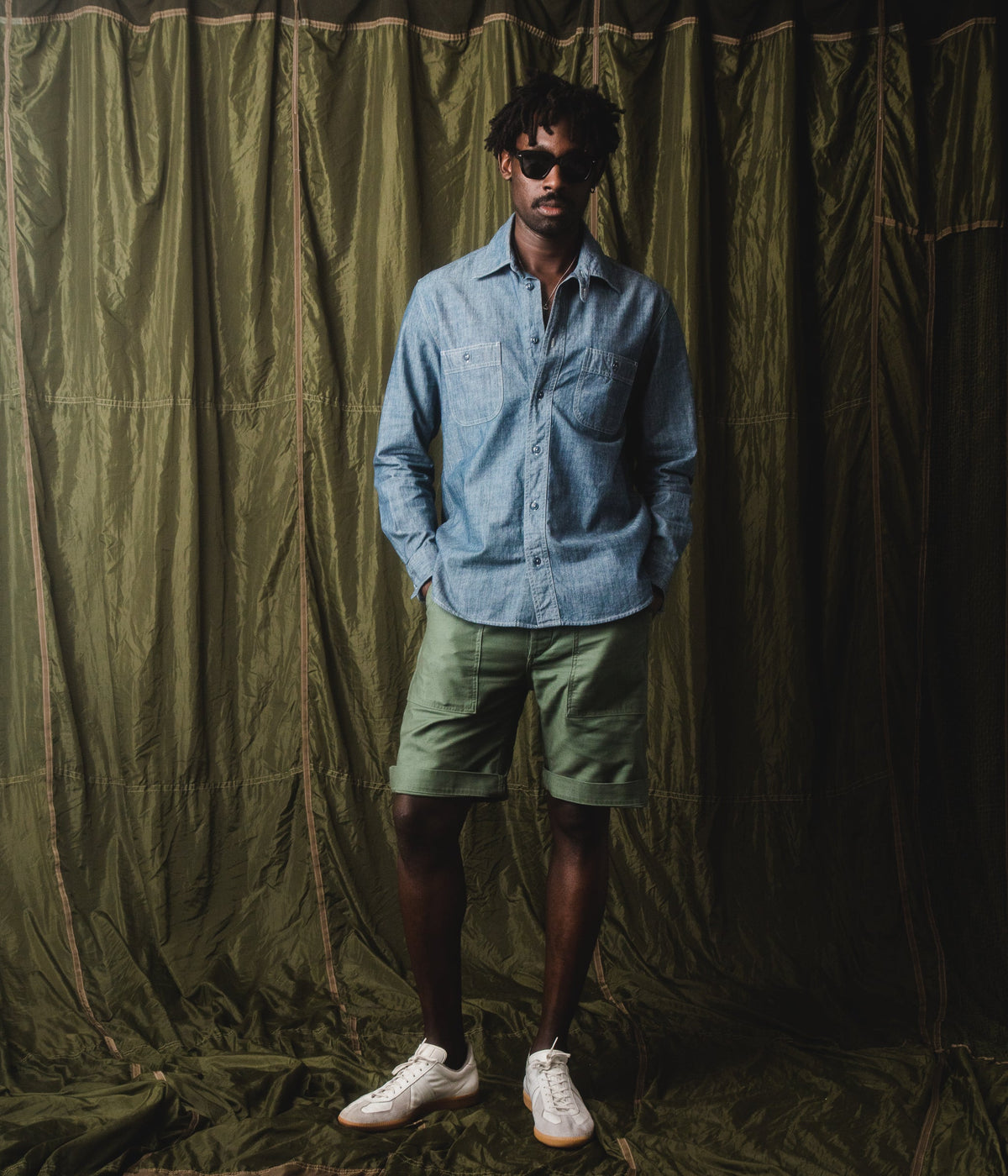
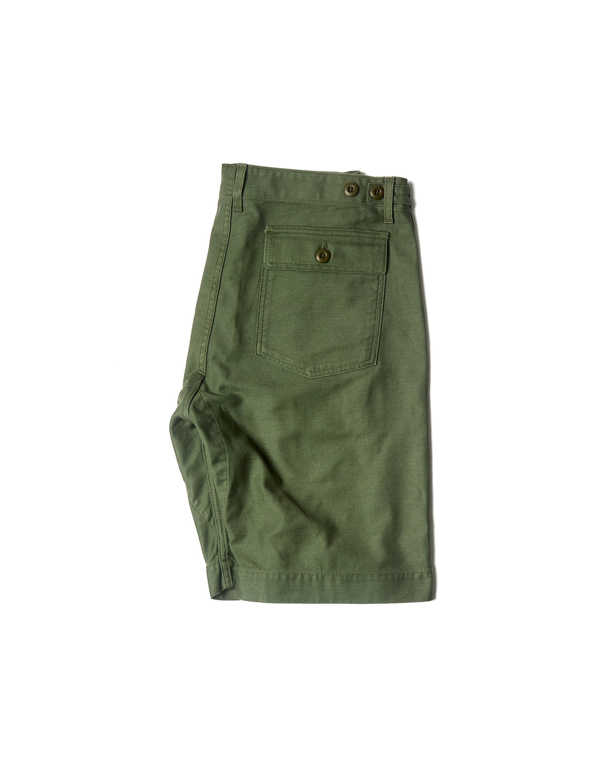
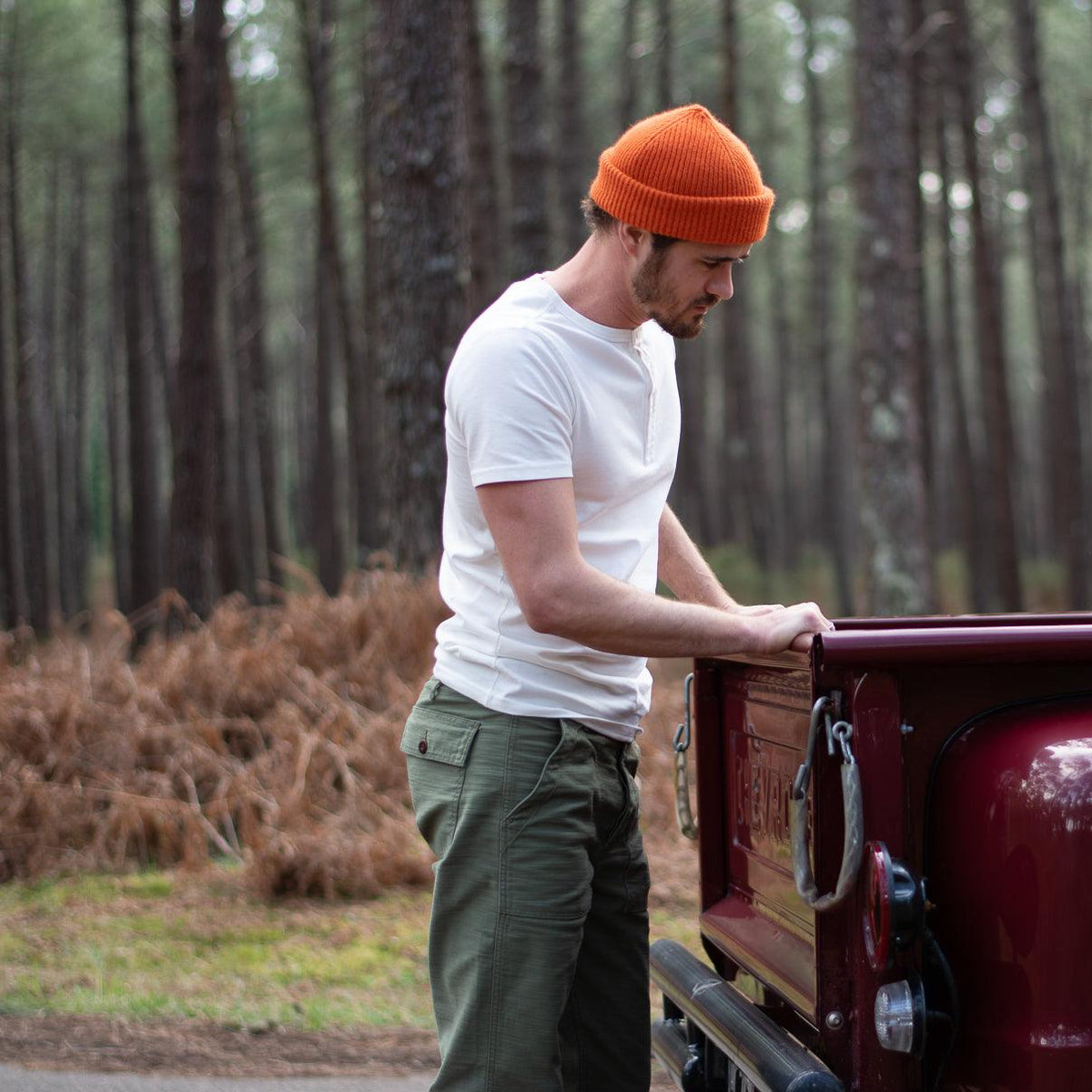
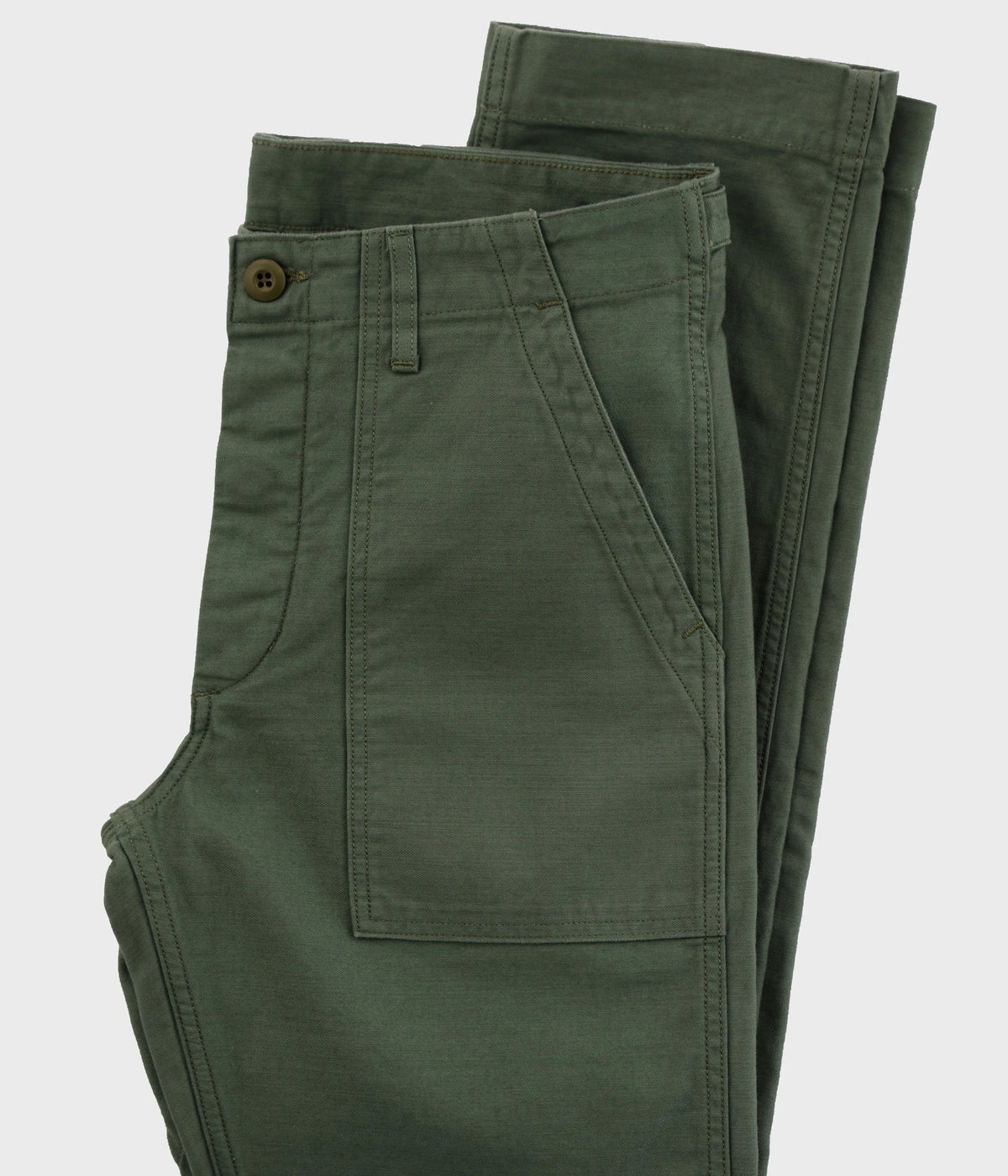
The sand of tent canvas and the olive drab of American utility uniforms, the green of OG-107 sateen, of our shirts and our utility pants. It is also, very closely, the color of indigo still in its bath.

The militaria half of the house: upcycled surplus, M-65s, jungle jackets. The mood for browsing this wardrobe: the pieces feel at home here.

#4A4C3B fond #EBEBEB encre #B9561A action
Champ de Manoeuvres Add to cart

Workwear

Ref. 05 · ivory & indigo

Indigo out of the vat, its green gone, set against the ivory of raw cotton: the only two colors of a work jacket before it takes its patina.

Softer than Light, earthier than Dark. It is the mood of Japanese jeans, moleskine chore coats and chambray shirts.

#E9E6DE fond #1F2A44 encre #2C3D63 action

Three colors, not thirty

Each mood rests on a background, an ink and an action color. Rules, fields and secondary surfaces are derived from them: that is what keeps everything balanced, whichever tint is chosen.

The garment doesn’t change

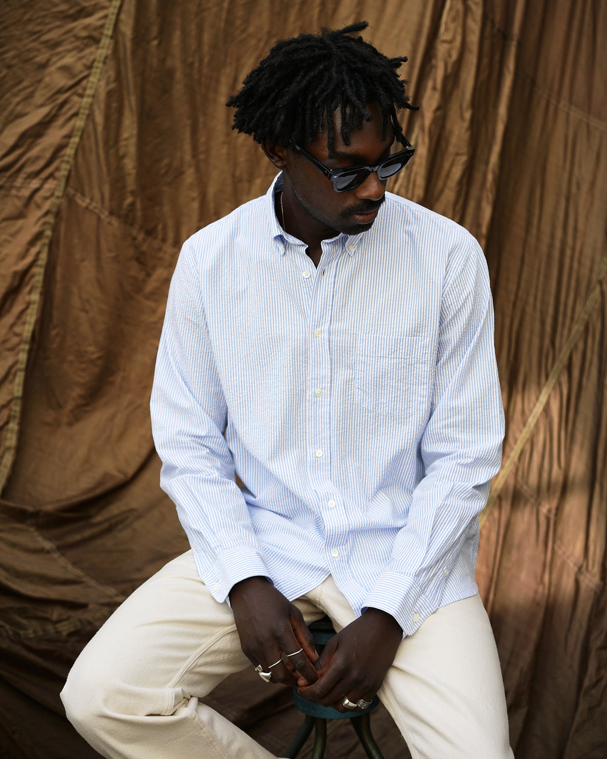
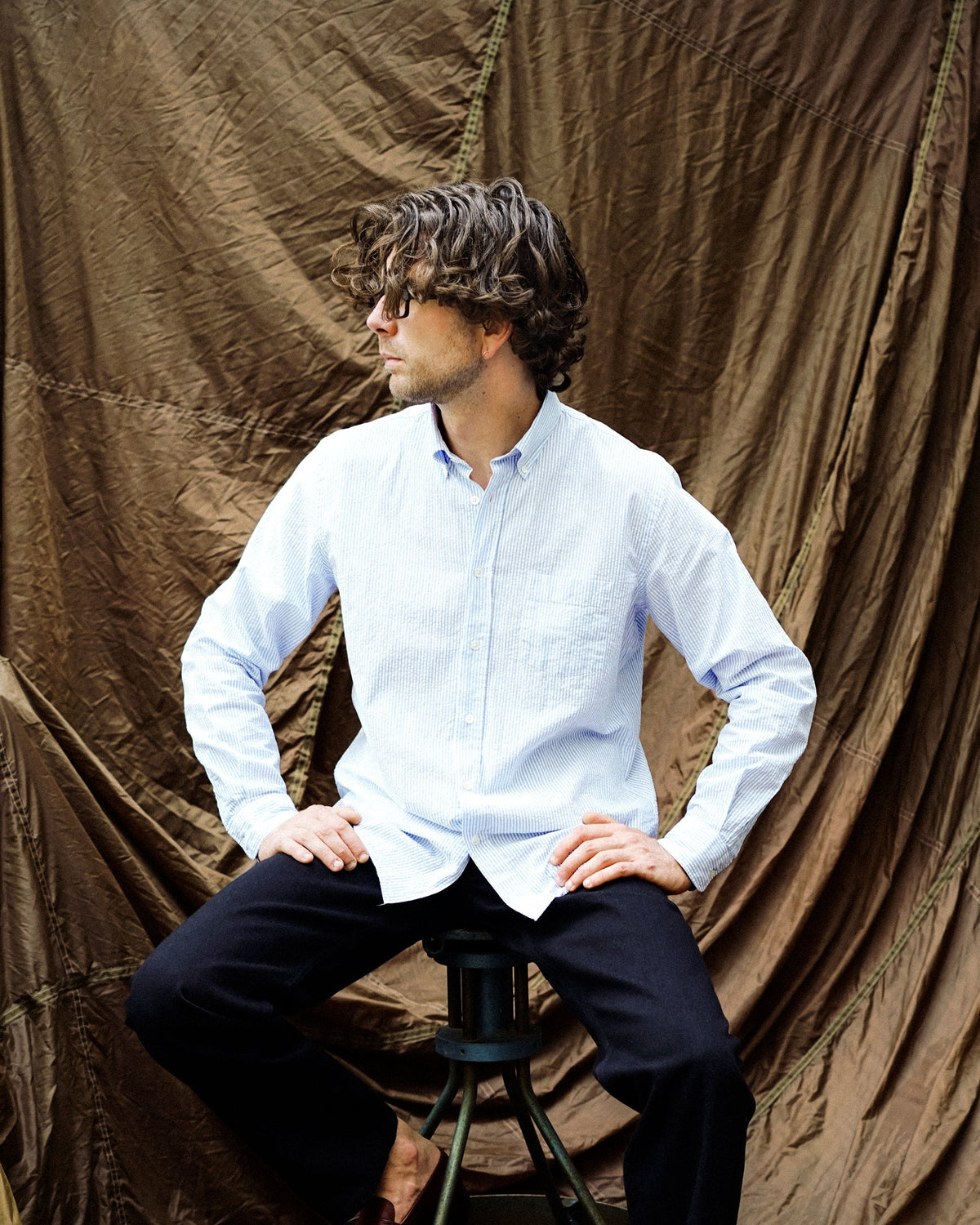
Product photos are never tinted. The color of a wool or a denim is judged as it is: only the surfaces around it change.

Your choice follows you

It stays in your browser, from one page to the next and from one visit to the next. Nothing is saved on our side, nothing is shared.